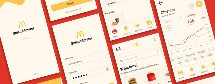
McDonalds Sales Monitor
Here is the app I designed during the Google UX Certificate course. Let me tell you a little more about it.

My prompt on Google UX Certificate was design a sales monitoring app for a large fast food chain. I thought of design this prompt locally, allowing comparisons between products to help each restaurant to analyse and increase their sales.
I chose McDonalds for this project because it is a big company with a data culture. Gartner recent studies shows many companies are still not ready for data analytics and there is also a interesting trend: less dashboards, more storytelling with data!
Research
I conducted interviews and created empathy maps to understand the users and their needs. The main user identified was the manager of a restaurant. This user confirmed that more than numbers by itself, they need to understand and collaborate to get insights for new actions.
Audit
Big companies use Business Intelligence (BI) applications like PowerBI, Tableau, Sisense, SAP and many others. Knowing these tools, we can say all of them need some time to learn, analyse and after all spend time loading data. After conducted a competitive audit, I focused on delivering an objective and easy to use, read and share data.
Tools: Personas, Journey Map, Storyboard, Empathy Maps, Competitive Audit.
Wireframes and prototyping
After sketching, I created a low-fidelity prototype on Figma.


Then, with an usability test, some findings were observed. A) The importance of keep connected or log in again in an easy way; B) A search field to make easy to find a group of charts or dashboard; C) An intuitive way to select and compare itens. All of them were delivered with the progress of the desing, in a high-fidelity prototype.

Tools: Usability test (Research Plan, Observation, Affinity Diagram, Pattern & Insights Identification), Wireframes and Prototyping (Figma, Material Design, McDonalds website, paper and pen).
Hi-fi prototype
Takeaways
The usability studies and feedbacks made me go beyond the first ideas and brought me new insights for solutions that can reach even more people and deliver an app more objective and easier.
Next steps
Test the usability for new insights and to be sure the pain points were solved. Certainly evolve the product for a management view, with comparison between restaurant or to see how a group of restaurants from a region are selling. Test accessibility resources like voice assistants will be a great point as well.
